Overview
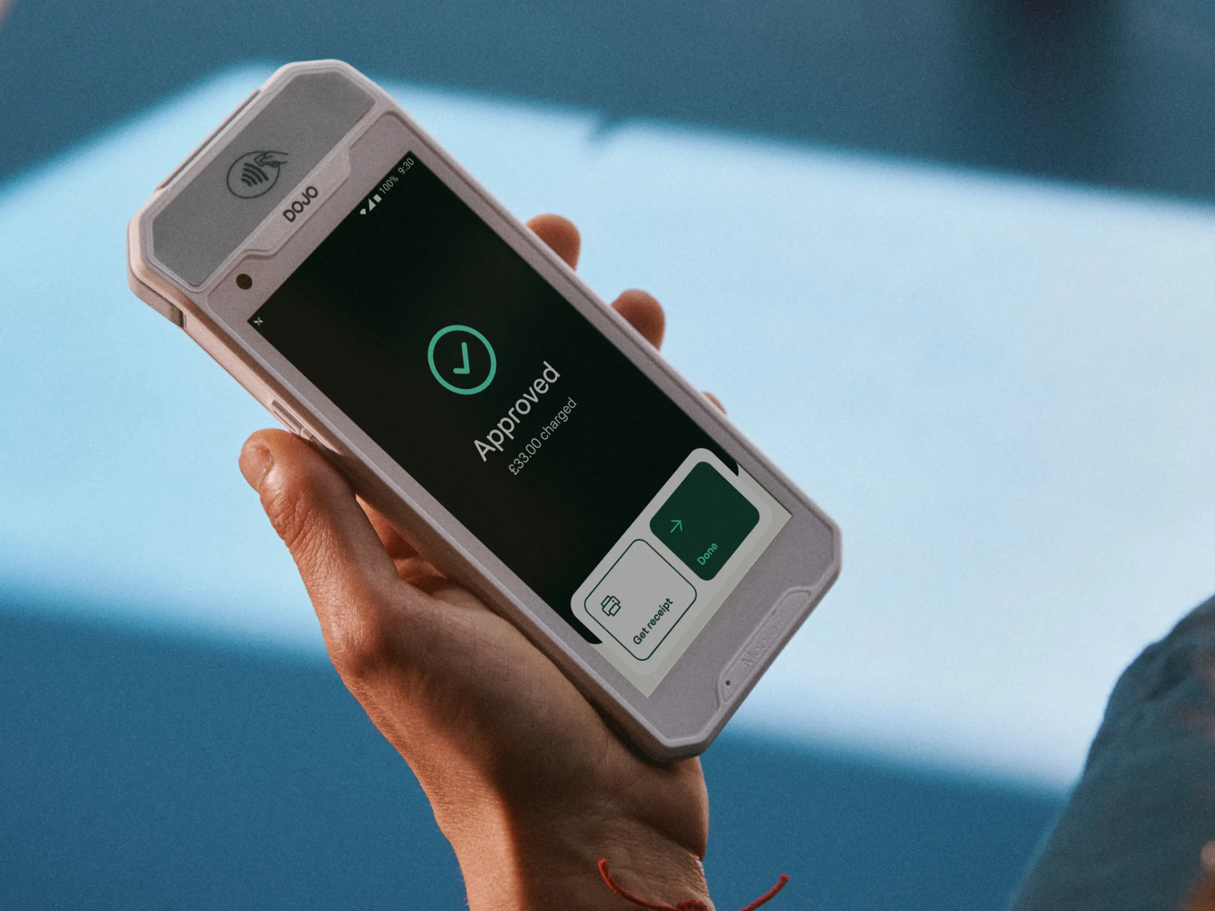
Dojo brought me in to raise the quality of design across its products. Its design system had grown quickly with the business and had become harder to use than it needed to be. I worked with design, engineering and leadership to set a clearer direction for both the system and the interface built on it.
Impact
Fewer tokens overall
The new system built on my proposed architecture went from 550 tokens to 186, with every name describing its purpose rather than the component it came from.
Fewer colour tokens
Colour went from 470 tokens to 106 in the new system, organised into clear roles for surface, text, action and feedback.
One token foundation for Web, iOS and Android
Proposed the architecture for a cohesive, learnable semantic system. Engineering built on it and began migrating every platform.
Uplift concepts for Dojo Pay and Sidekick
Showed what stronger foundations make possible: re-harmonised colour, clearer surface hierarchy, and more varied layout and rhythm.
An evidence-backed route, agreed with leadership
Grew the brief from a UI uplift into four scoped routes and a feasibility test on a real component, played back as a decision matrix.