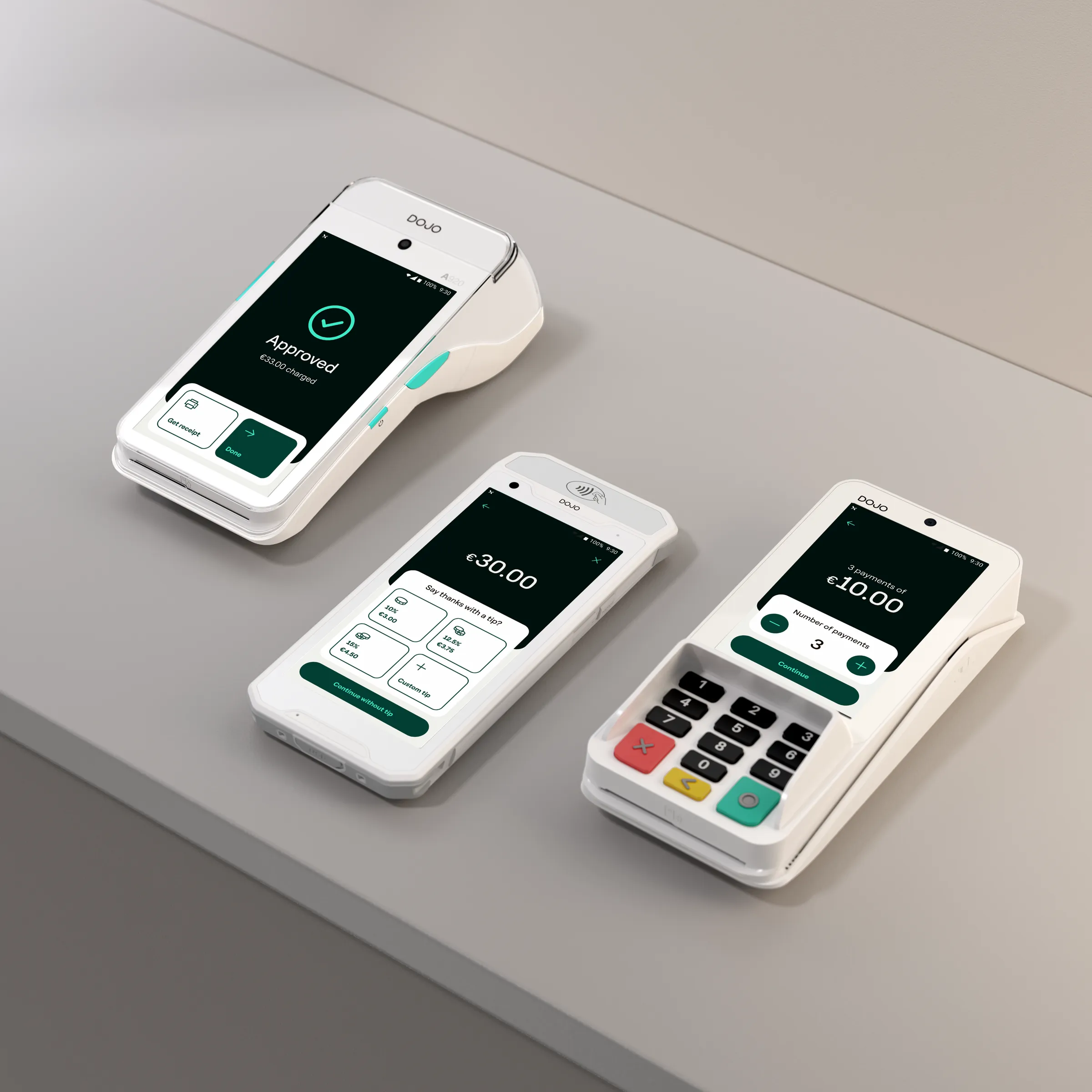
Overview
Alongside the foundations, I designed concepts for Dojo Pay and Sidekick showing what a stronger system would make possible: the same products, with re-harmonised colour, clearer surface hierarchy, and more varied layout and rhythm.
Each concept came with usage guidance and anatomy, so it could feed straight back into the system.
Component by component
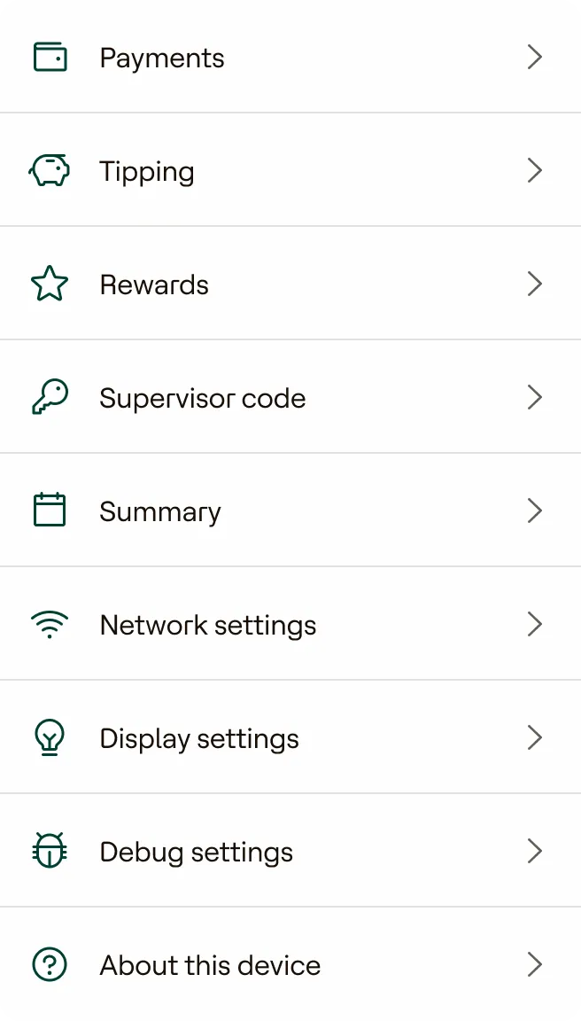
Each component rebuilt on the same tokens, so the change carries across every screen that uses it.
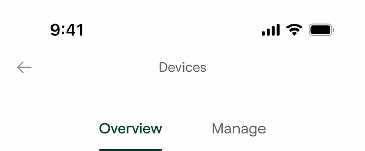
Tabs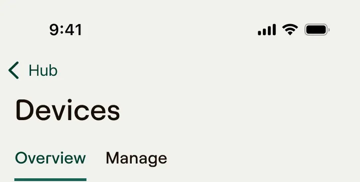
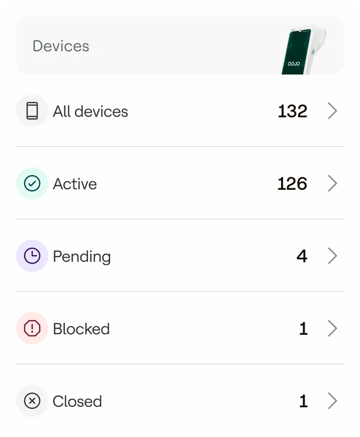
Status list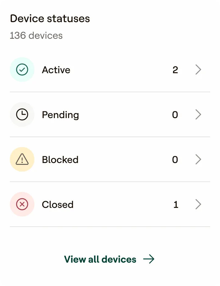
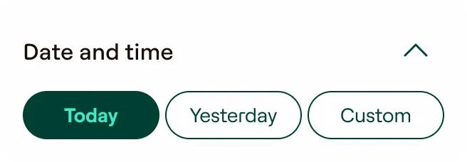
Filter chips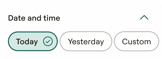
List tiles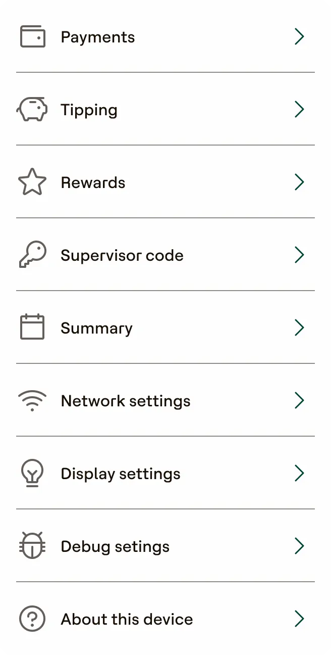
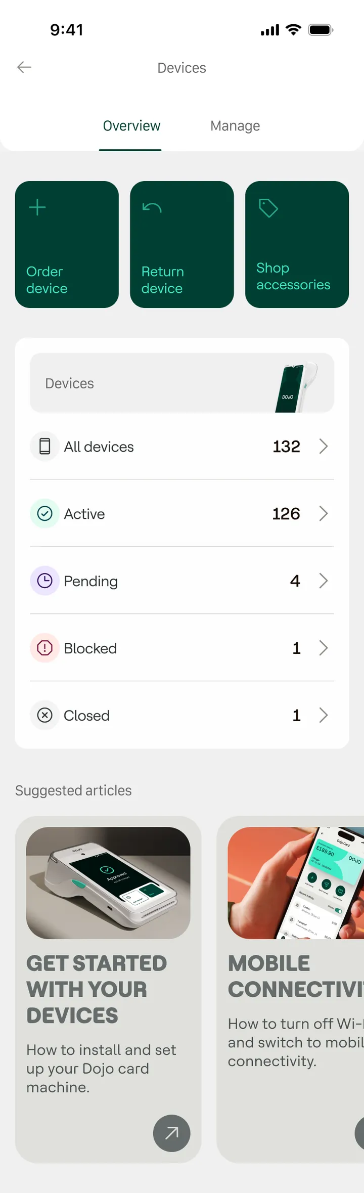
The whole screen
The same Devices screen, rebuilt on the new tokens: clearer visual and spatial hierarchy, and a consistent vertical rhythm.
Before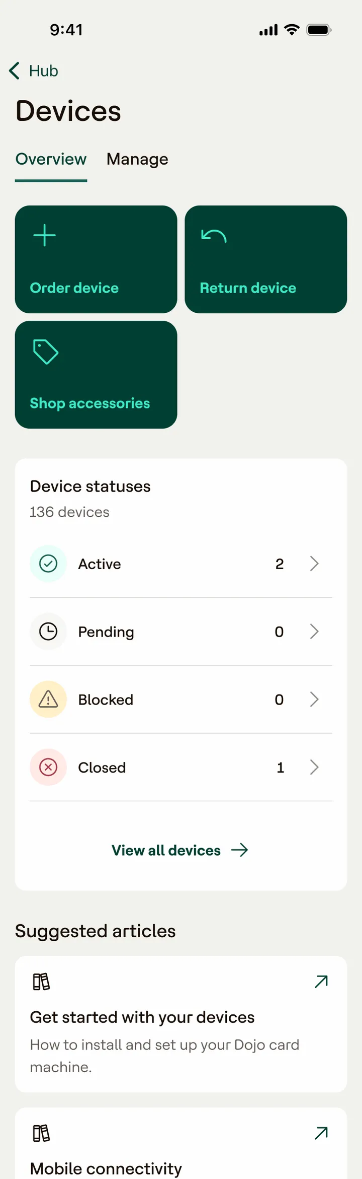
After