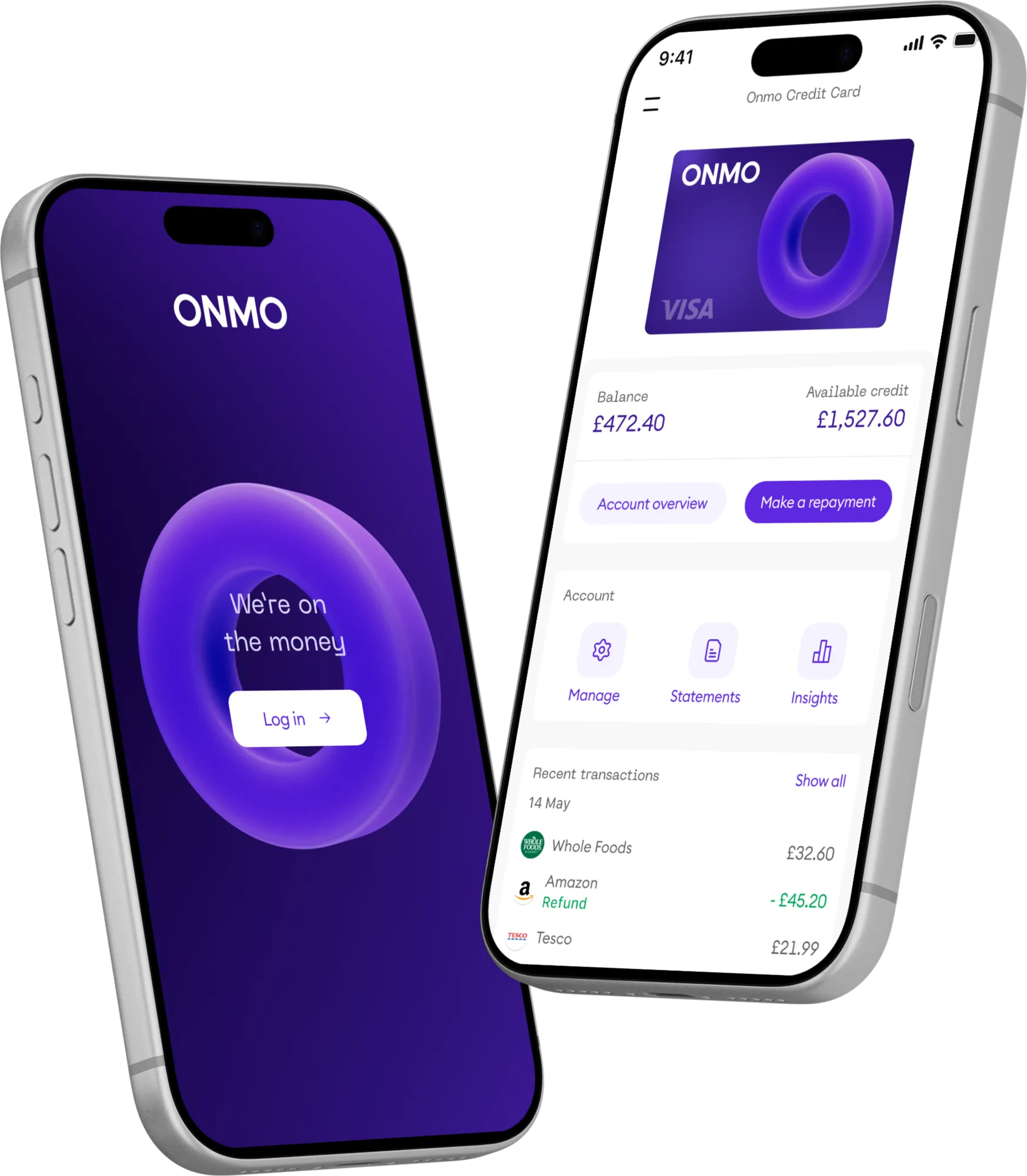
Overview
ONMO is a UK credit card, a regulated product where customers need to understand exactly where they stand. The app had grown quickly, built by several freelancers, and the experience had become inconsistent: patterns varied between journeys, key account information was hard to find, and the homepage tried to show everything at once.
As the company’s first in-house designer, I redesigned the app end to end over 6 months. In parallel, I set up ONMO Lab with a UX designer, so every key journey was tested with customers as it was designed. I partnered closely with engineering and the teams closest to the problems: Customer Support, Finance and Compliance. The aim was an app that answered customers’ questions before they needed to call, aligned with the new brand, and could grow with the product portfolio.
Identifying the real problems
Early on, I worked with Customer Support, Finance, Compliance, Credit and the SLT to understand what each team was seeing. These insights shaped our priorities and ensured the redesign focused on the problems customers and the business faced.
Customers struggled to find and understand critical account information.
A high volume of missed payments and accounts falling into arrears.
Unclear messaging that risked falling short of Consumer Duty.
With Customer Support, we analysed complaints, tickets, and qualitative feedback across key journeys such as payments and card management.
Top 7 reasons customers contacted Customer Support, by share of all interactions. Highlighted: the reasons the redesign targeted.
Understanding the ecosystem
To see the full picture, I mapped the whole app and looked into every area that would shape the redesign.
I reviewed analytics, customer behaviour, and existing technical constraints to understand where we had flexibility to innovate and where we needed to design within existing infrastructure.
Six inputs that framed the redesign, mapped alongside the design work and revisited as it evolved.
Redesigning the information architecture
Addresses: Customer SupportMost calls to Customer Support came from customers who couldn’t find or make sense of their account information. The old app hung everything off one dashboard and requested too much at once, causing slow load times and technical issues. I restructured the information architecture to surface what mattered most and load only what each screen needed, so the new app felt noticeably faster.
I aligned the new structure early with engineering to avoid unnecessary technical debt and unblock faster delivery downstream.
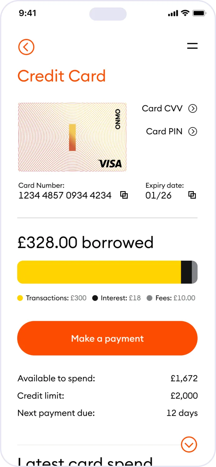
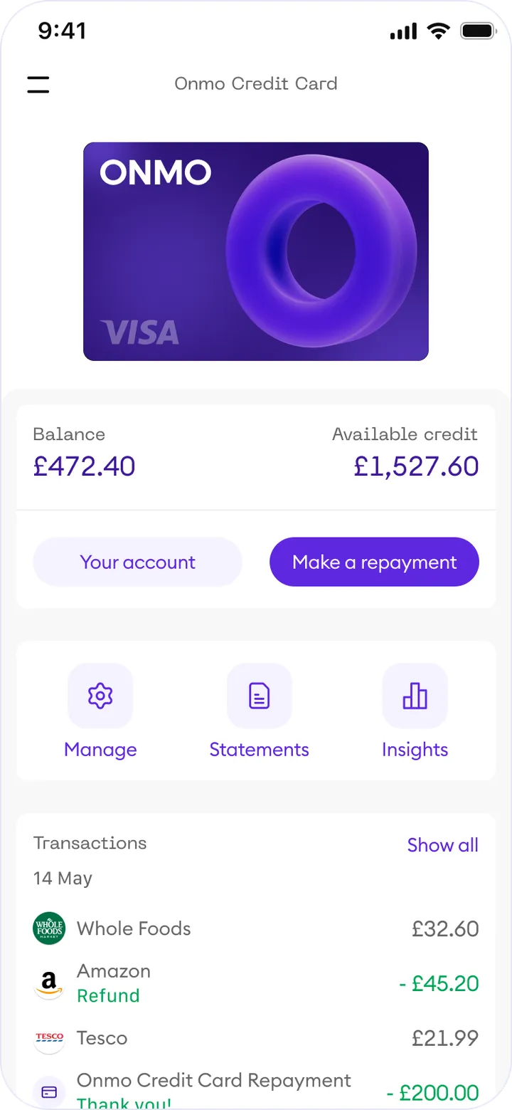
Where the old app had legal documents in three places, each product now follows the same pattern of Manage, Statements and Insights, so a new product could slot in without restructuring the app.
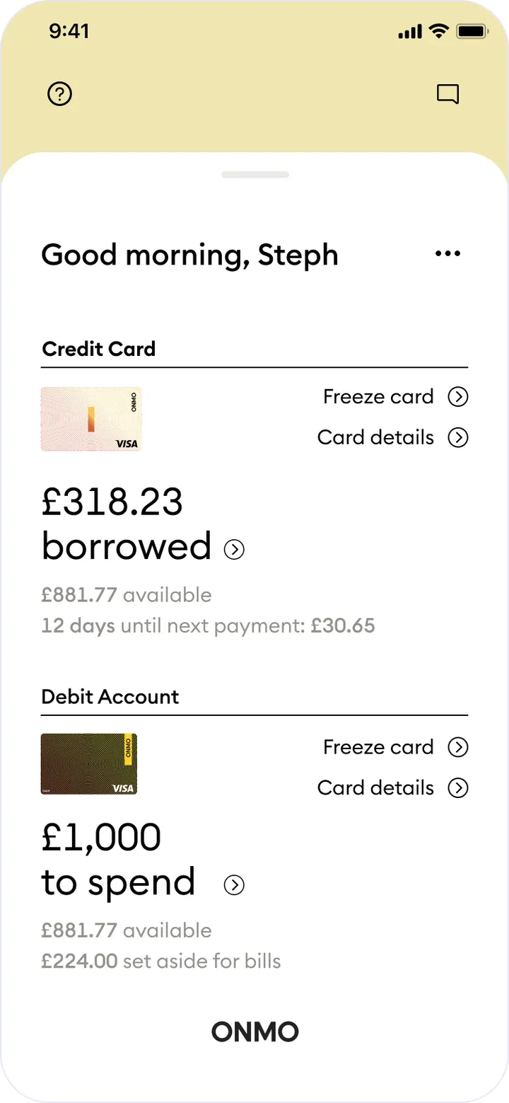
Top two levels of the app, before and after the redesign. Highlighted: the pattern every product shares.
Reducing cognitive load
On the homepage, I gave each feature its own space, with secondary information behind expandable cards and dedicated pages. Customers saw what mattered first, and each feature could grow to hold more information without crowding the rest of the app.
Making the account easy to understand
Addresses: ComplianceCompliance’s concern was clarity: under Consumer Duty, customers needed to understand their account and what each decision meant for them.
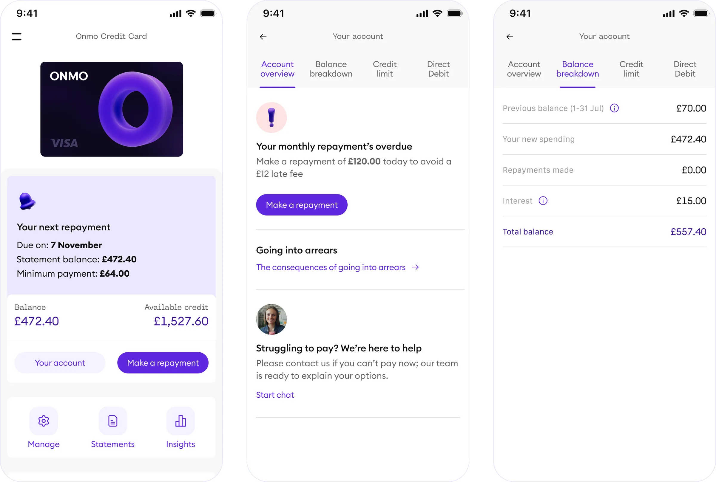
I rebuilt the account area into four clear tabs: account overview, balance breakdown, credit limit and Direct Debit, then layered explanation through it. Tooltips define terms in place. Section explainers answer the questions customers worry about, such as what happens if an account goes into arrears.
The balance breakdown came out of testing. My first redesign made the next repayment clear on the homepage: the due date, statement balance and minimum payment. Customers could see the numbers, but not what made them up. Many were building or rebuilding their credit, and financial terms weren’t always familiar, so I designed a breakdown that shows the balance line by line, from previous balance and new spending to repayments and interest, with a tooltip on anything unfamiliar.
In the first round of ONMO Lab testing, participants said they had never had anything as transparent before. They also showed where it fell short: some weren’t sure what the fees were for, and others wanted to see their credit limit without working it out. The next iteration added that context, with tooltips on each line and the credit limit in its own tab.
Compliance reviewed every explainer and message before release, so the wording was accurate and fair from the start.
Making repayments clear
Addresses: FinanceMissed payments were Finance’s biggest concern, and research showed most customers were unsure how much they needed to pay to get their account back on track. I redesigned the repayment journey around that question, with a predefined header for each repayment option: minimum payment, statement balance, full balance and a custom amount.
Each option carries a contextual tip that makes the amount and its trade-off clear, along with the balance left after paying.
Notifications and communications
Working closely with Customer Support and the Credit team, I redesigned how ONMO communicated with customers across in-app, push, and email, timing and escalating messages against exactly where someone sat in their repayment cycle: from a friendly reminder days before a payment, through to a clear, non-alarming explanation once an account reached arrears.
This escalating approach contributed to the drop in missed payments shown in the results below.
One constraint shaped the arrears journey. While we were migrating payment providers, the back end could only block further spending 10 days after a missed payment. ONMO Lab research showed many customers found managing their finances hard, and 10 days gave them room to build more debt, so I worked with Credit on blocking spending after just a few days. We couldn’t ship it until the new provider was fully integrated, so I designed the communications around the 10-day window at launch, and the shorter window followed a few months later.
Alongside the messages, I introduced contextual notifications and card states to highlight critical actions, such as upcoming repayments or missed deadlines.
Designing for scale and future products
While redesigning the core experience, the business was actively exploring new offerings, including a Business Card and future lending products, both without fully defined requirements.
Rather than wait, I designed a flexible navigation model that could accommodate new product lines without disrupting the existing experience. This included:
Motion and iconography
Alongside improving usability and content structure, I introduced motion design patterns and 3D iconography to bring a sense of delight to the experience, making the new branding feel alive within the app and reinforcing trust through visual and behavioural consistency across all ONMO products.
Impact
Together, the new journeys made the app the place customers went for answers, reducing the need to contact Customer Support.
I worked closely with Finance and Credit to track the impact of each release, so design decisions were measured against business outcomes as well as usability.
Fewer missed repayments
Measured in the second quarter after launch, which also meant fewer late fees for customers and lower write-off losses for the business.
Fewer calls about account information
In the first quarter after launch, calls about locating account information dropped by 41%, falling out of Support's most common contact reasons.
Never had anything as transparent
What participants said about the balance breakdown in pre-launch testing.