Defining a clear position
One of the first priorities was defining a clear brand position in an increasingly crowded fintech market. For a regulated credit product, trust, clarity, and differentiation weren’t just brand considerations, they were business-critical.
I started by defining a creative brief to align leadership on the role the brand needed to play: credible and transparent, but not static or conservative. From there, I partnered with a senior freelance designer to explore and pressure-test early visual directions.
Identifying the opportunity
We analysed the competitive landscape across UK and US fintechs, looking at how emerging banks and credit products expressed trust, innovation, and value through colour, typography, motion, and tone.
A clear pattern emerged:
- Some brands were overly playful and friendly, but lacked credibility.
- Others appeared trustworthy, but felt static and uninspiring.
This revealed a strategic gap for ONMO to occupy: a digital-first brand that balances financial credibility with the energy and optimism of a modern tech product. That positioning became the foundation for every design decision that followed.

Exploring and selecting a direction
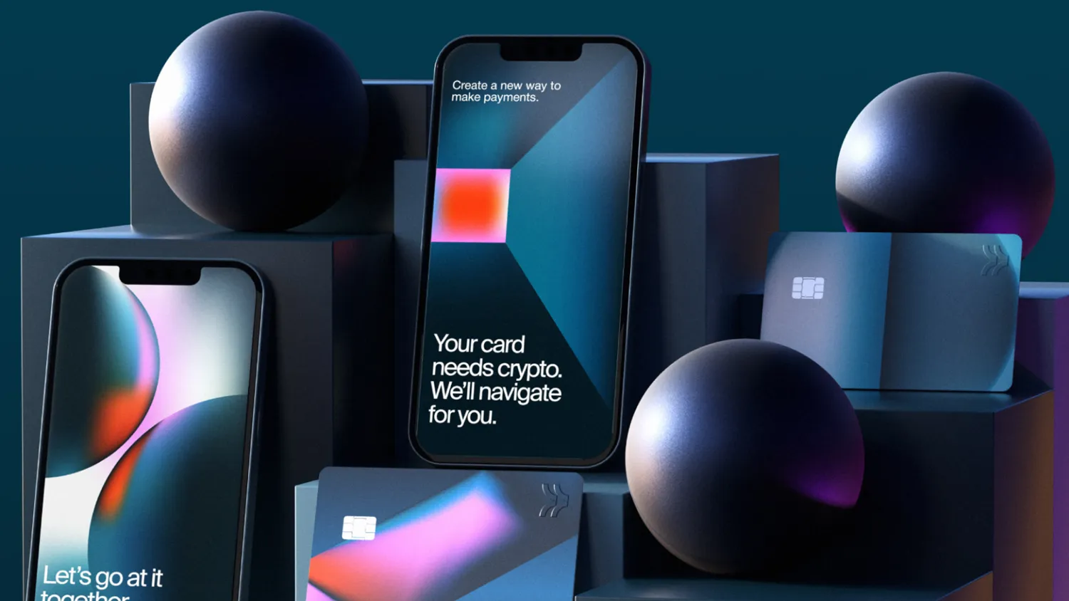
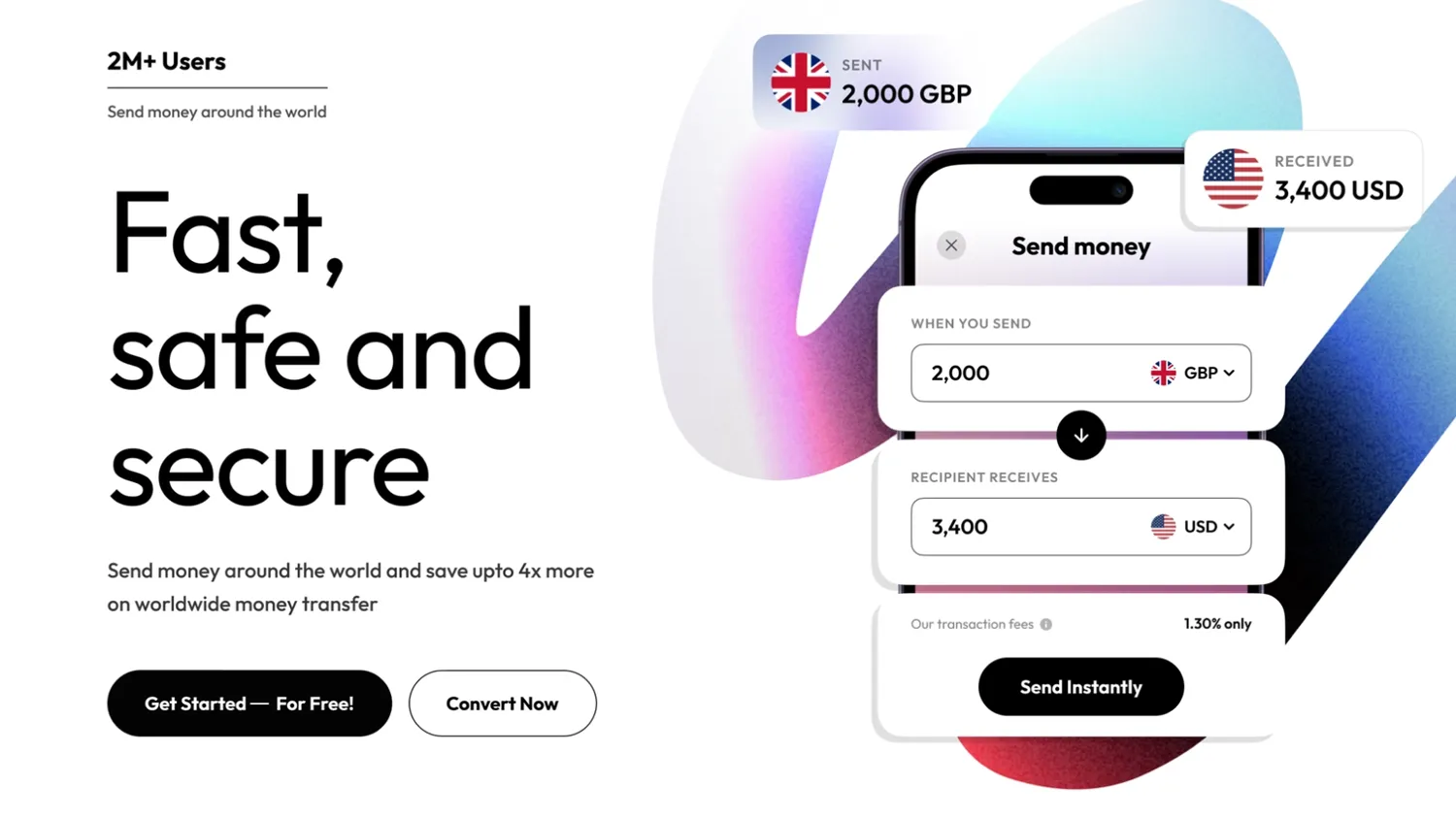
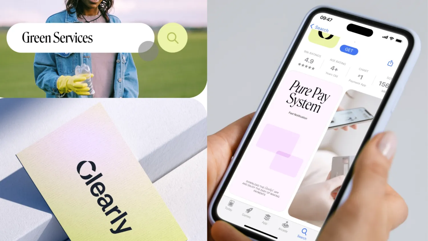
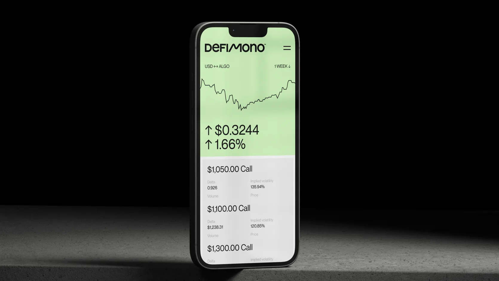
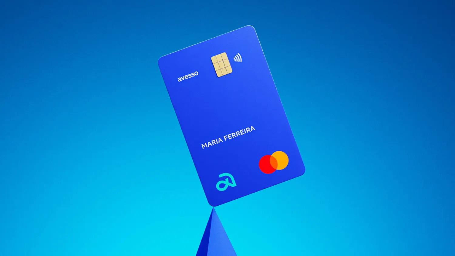
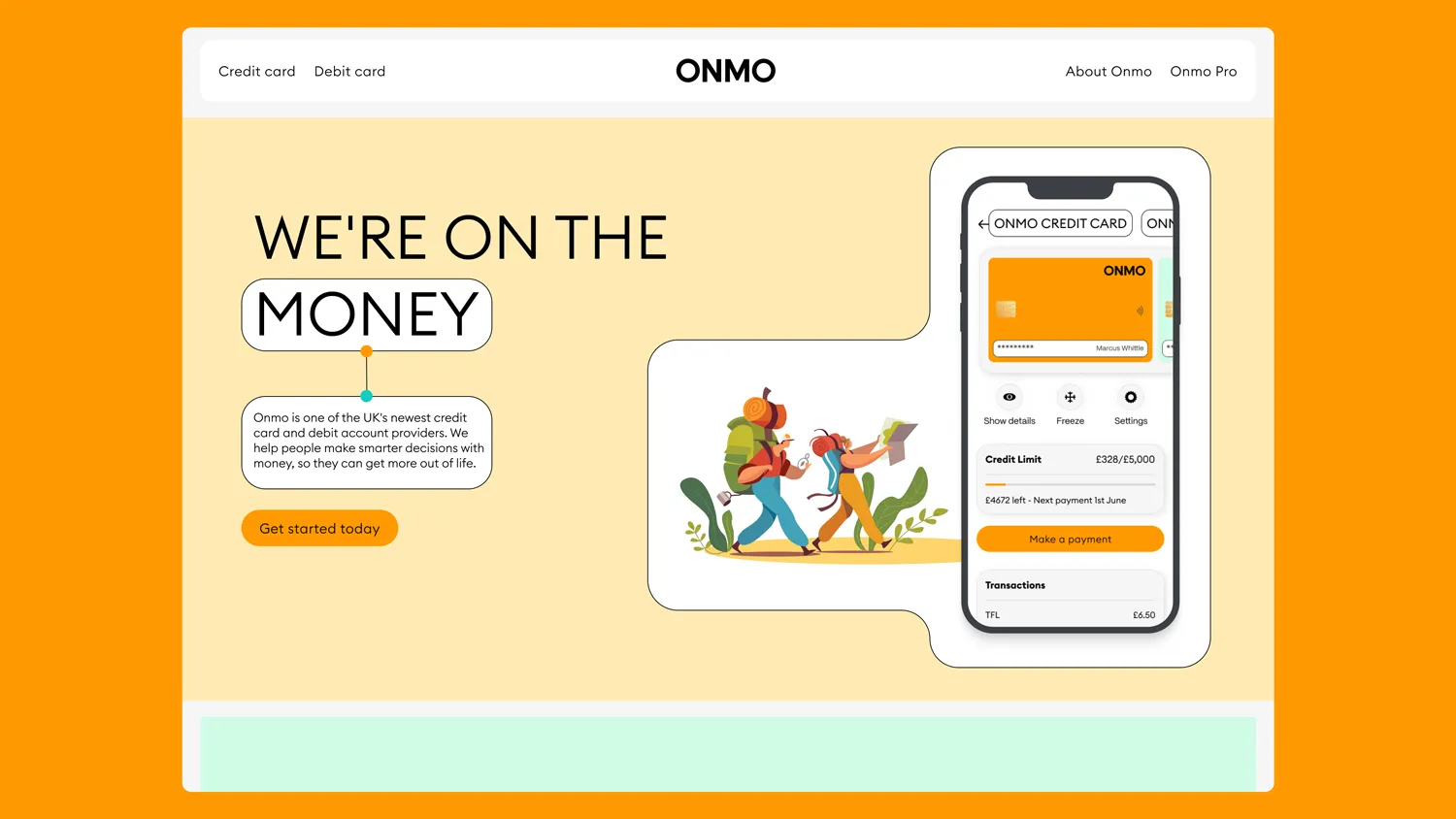
We developed four distinct visual territories to explore how this position could be expressed.
These concepts were intentionally broad, designed to test ideas and strategic fit before refining execution.
Presenting these directions to the CEO and investors created alignment and confidence, allowing us to converge on a single, clear direction and commit to it decisively.
The direction we chose succeeded where the four territories, and the wider market, hadn’t: it kept the credibility of the more conservative options without their rigidity, and the energy of the playful ones without losing trust, striking the exact balance the original brief called for.

Bringing the brand to life
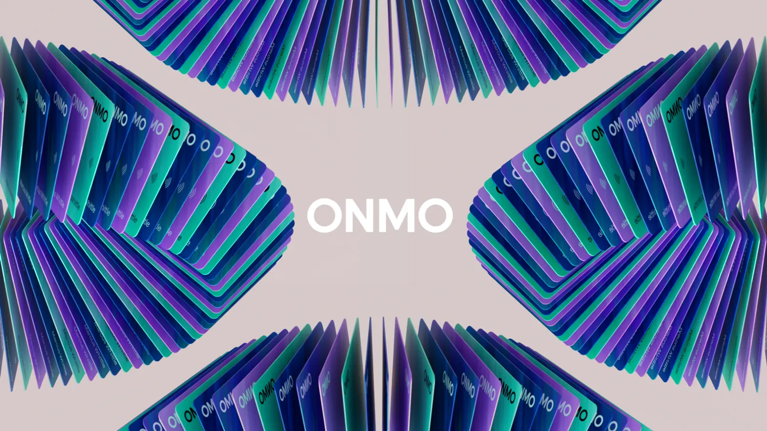
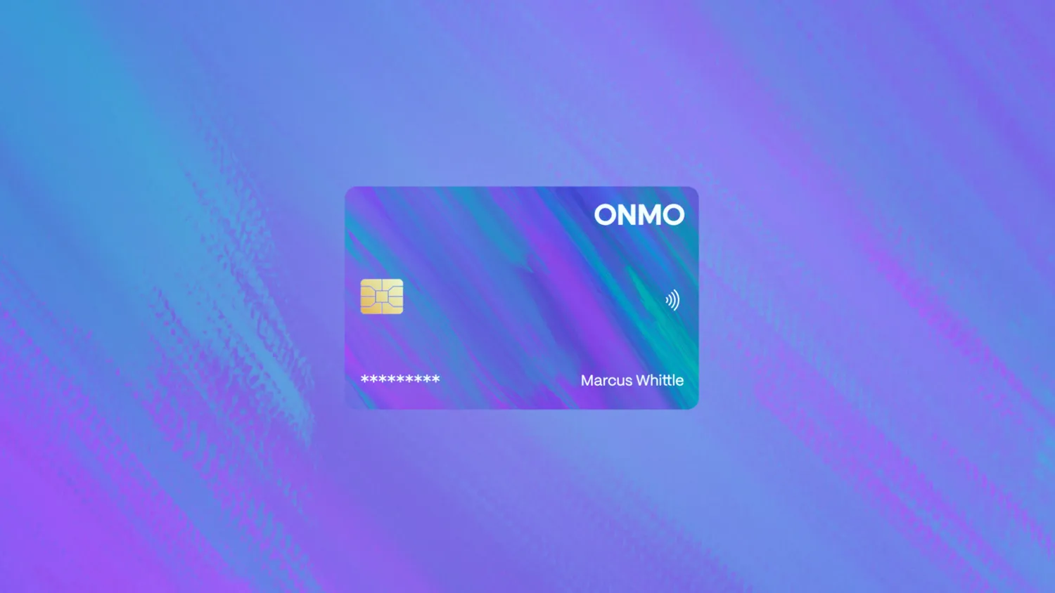
With the direction set, I focused on building a flexible, digital-first identity that could scale across product and marketing. Key decisions included:
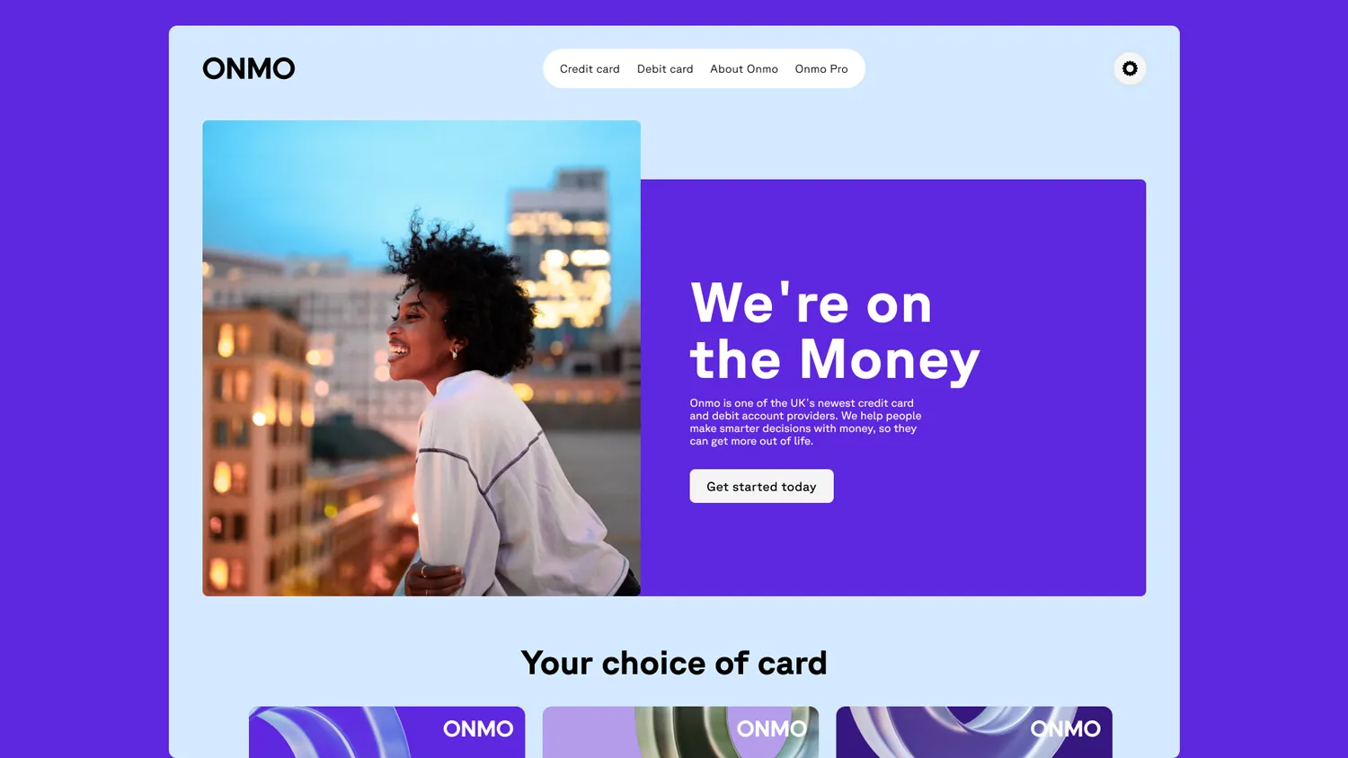
- A dual-type system to balance functional UI needs with expressive brand moments
- A refined colour palette, tested rigorously for accessibility and contrast
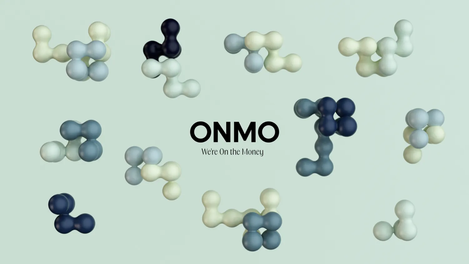
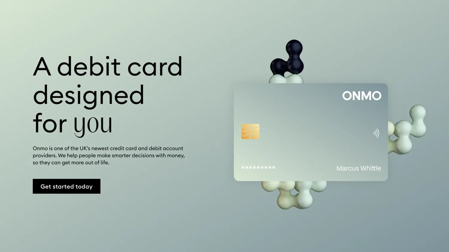
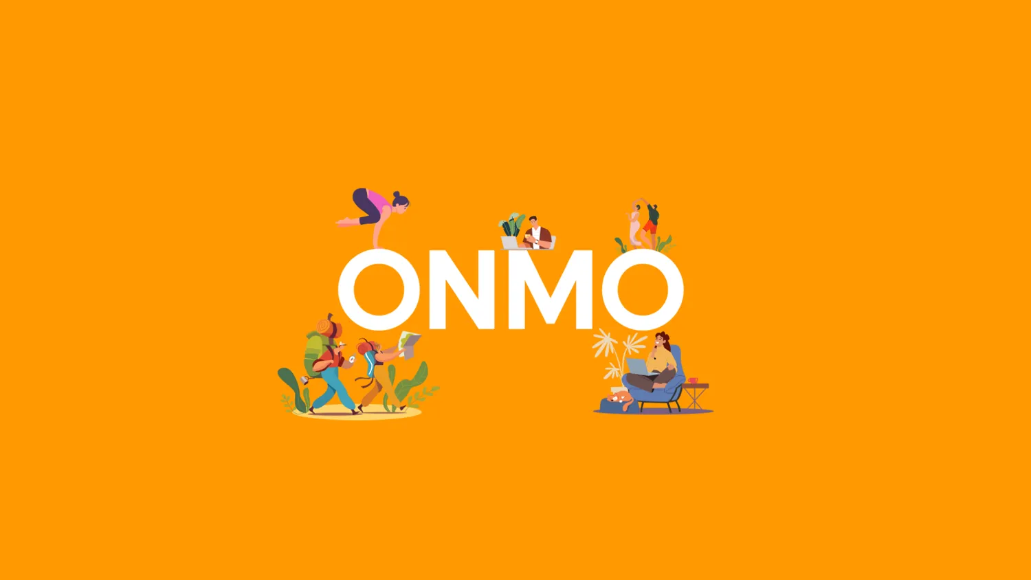
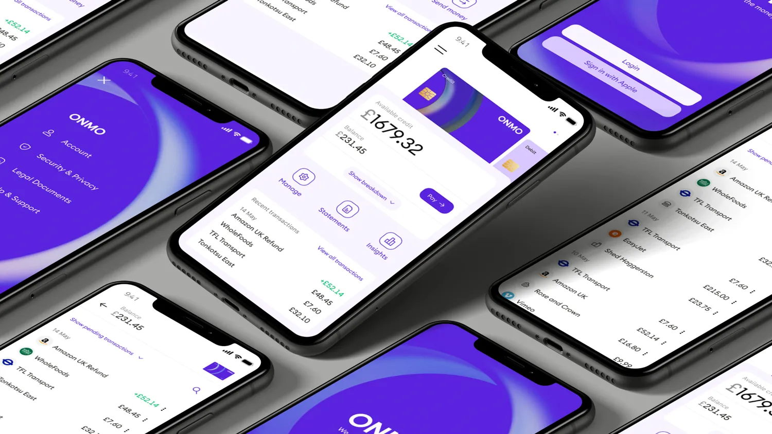
- A bespoke visual language using iconography and 3D illustrations to create distinction without sacrificing clarity
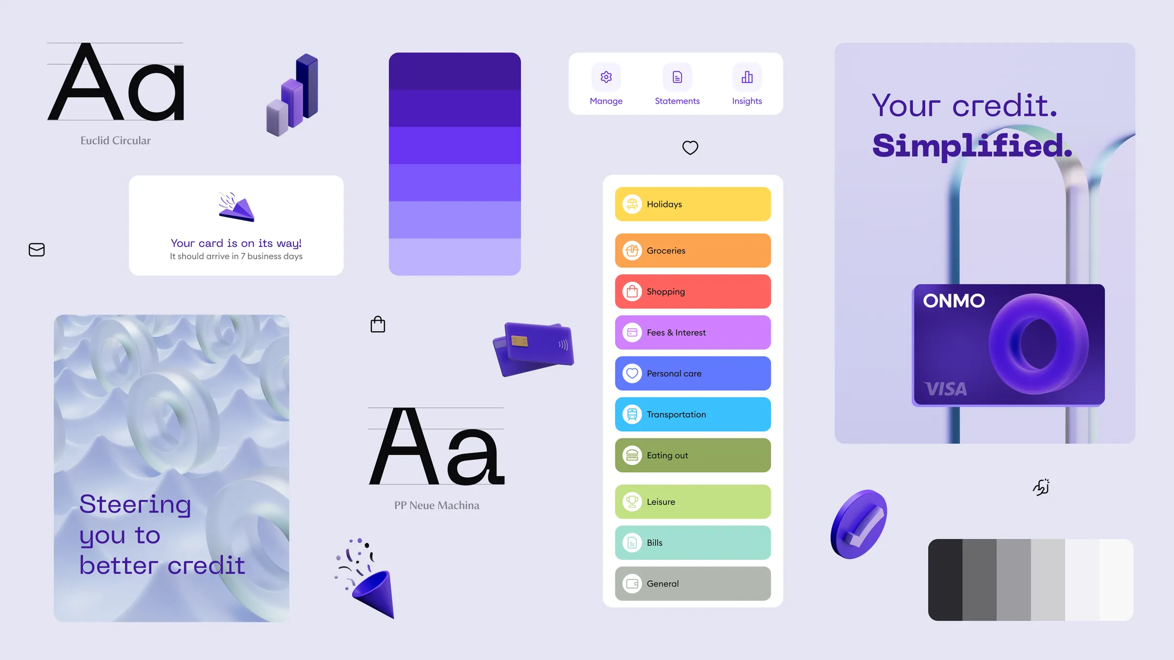
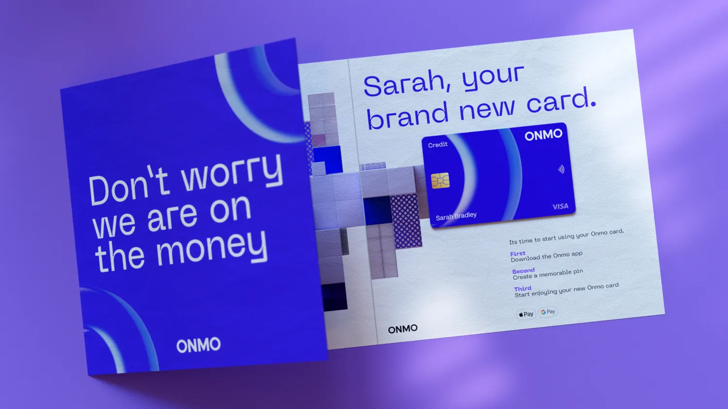
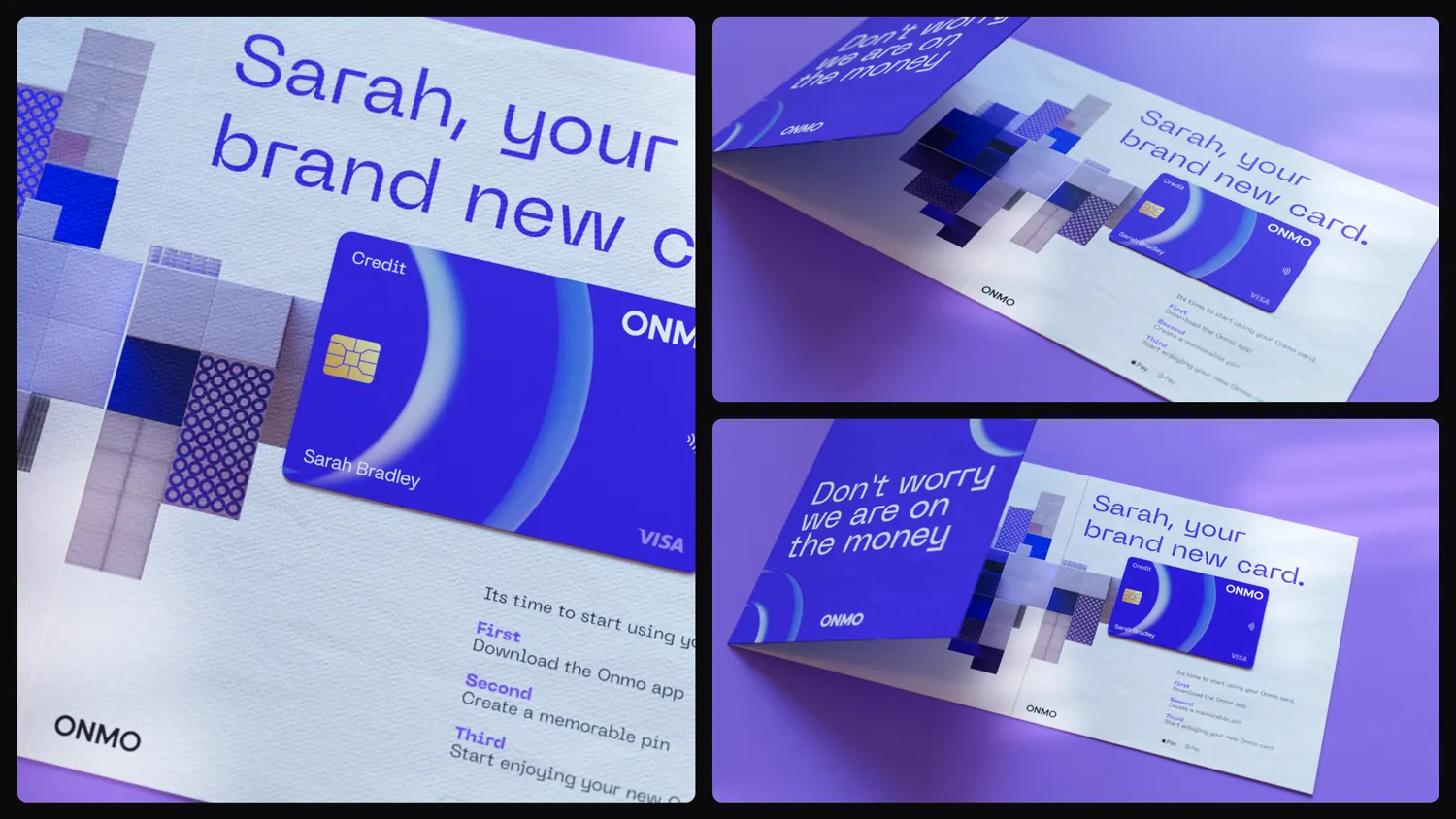
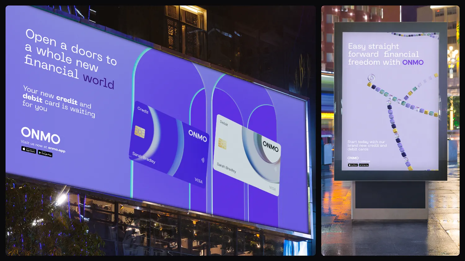
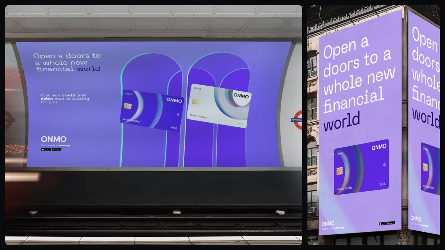
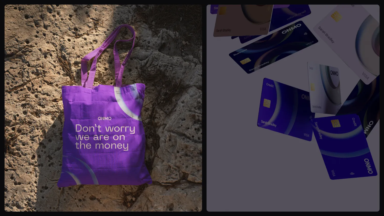
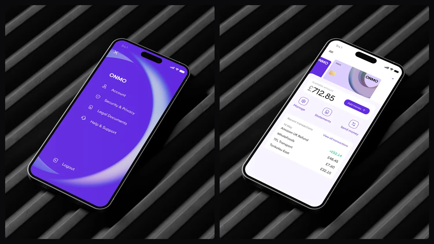
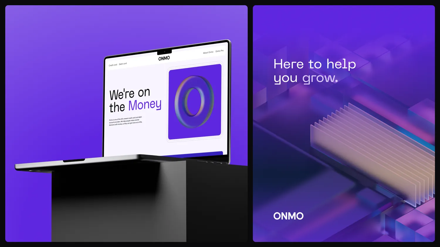
These foundations were designed to work consistently across the app, website, credit card, and marketing channels.
With the foundations in place, I pulled everything together into a presentation deck, showing how colour, type, and visuals worked together across formats, and shared it with the company, investors, and our customers.


Validation and impact
To validate the new identity, I led both internal and external testing at different stages of the process.
Early on, we ran a lightweight customer survey to understand how the new direction made people feel, focusing on trust, clarity, and confidence. This helped us refine the visual language before committing to full rollout.
Internally, teams across the company quickly adopted the new brand, signalling clarity and shared ownership.
“I really like the colour scheme and the logo. It feels very professional and modern. I currently carry 5 cards (including ONMO) and this is by far my favourite.”
“Looks like a premium product one you want to use.”
“I think it looks clear and says everything u want to see and it looks cool at the same time.”
Early customer survey on the new app and card branding, run before the full rollout.
To make sure it worked beyond our own customers, we then tested the new brand against the old with an independent research agency and 5,000 UK participants.
The new brand scored 78/100 across brand perception metrics
84% preferred the new identity
The dominant associations were modern, trustworthy, and confident, the exact attributes defined in the original brief
This validation gave us the confidence to roll the new brand out across all channels, starting with the website and app.
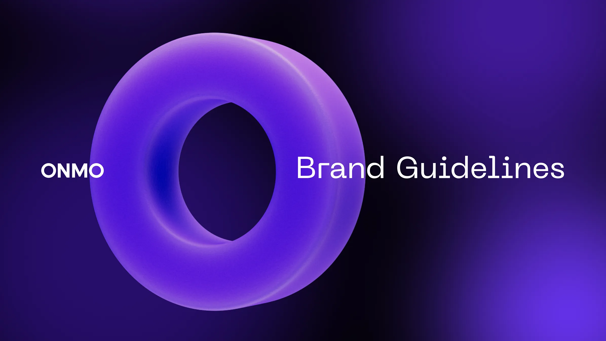
Brand guidelines
To support consistent rollout and long-term scale, I created a comprehensive set of brand guidelines covering product, marketing, and internal use. The guidelines became the single source of truth for teams across the company, enabling faster execution and confident adoption of the new brand.