APP REDESIGN
Overview
The existing ONMO app had been built quickly by multiple freelancers, resulting in inconsistent patterns, unclear information hierarchy, and unnecessary cognitive load across core journeys.
My goal was to redesign the app from the ground up — aligning it with the new brand, improving clarity and performance, and ensuring the experience could scale as the product portfolio expanded.
Understanding the ecosystem
Before redesigning the interface, I mapped the app end-to-end — validating user journeys with Compliance and Commercial teams to ensure accuracy, transparency, and regulatory alignment.
I also reviewed analytics, customer behaviour, and existing technical constraints to understand where we had flexibility to innovate and where we needed to design within existing infrastructure. This groundwork allowed us to move fast later without introducing technical or regulatory risk.
Identifying the real problems
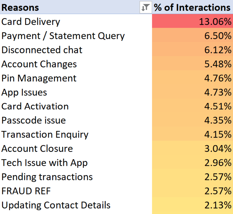
Working closely with Customer Support, I analysed complaints, tickets, and qualitative feedback to identify recurring issues across key journeys such as payments and card management.
Two themes stood out:
- Users struggled to find and understand critical account information
- Important deadlines were being missed, directly impacting the business
These insights shaped our priorities and ensured the redesign focused on real problems, not cosmetic change.
Redesigning the information architecture
I restructured the app's information architecture to surface what mattered most, reduce cognitive load, and make ONMO the primary channel for customers to manage their products.
I aligned the new structure early with engineering to avoid unnecessary technical debt and unblock faster delivery downstream.
Key objectives:
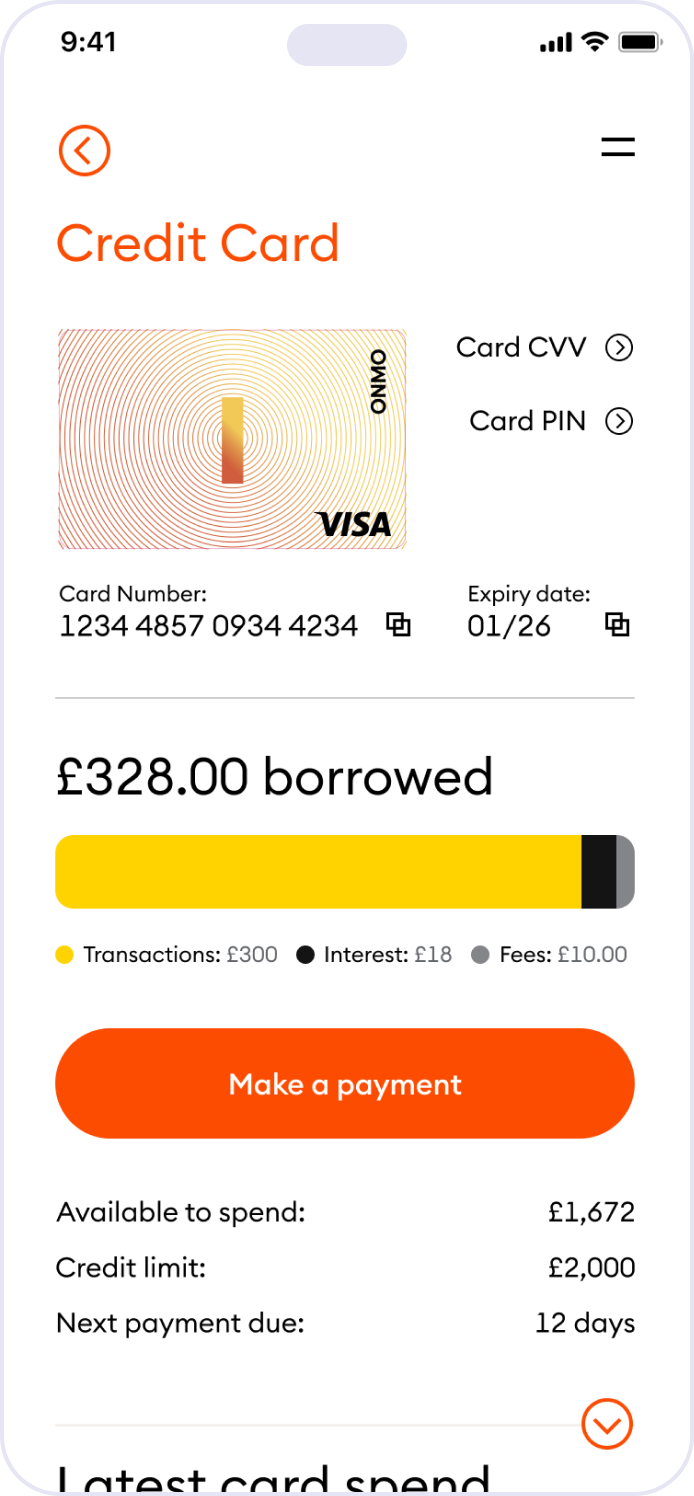
- Make balances, card status, and key actions immediately visible
- Clarify hierarchy and navigation to guide users intuitively
- Design a structure flexible enough to support future products
Improving clarity, performance, and trust
I started by addressing the information architecture — restructuring how key information was organised and surfaced across the app. This allowed us to introduce expandable card patterns, contextual tooltips, and dedicated views that presented more information with greater clarity, reduced cognitive load, and improved recall.
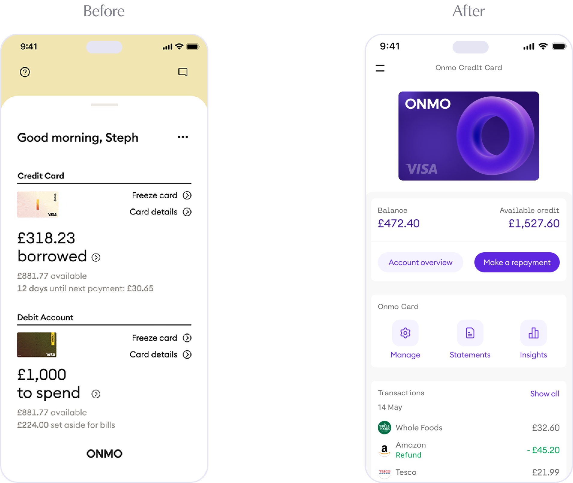
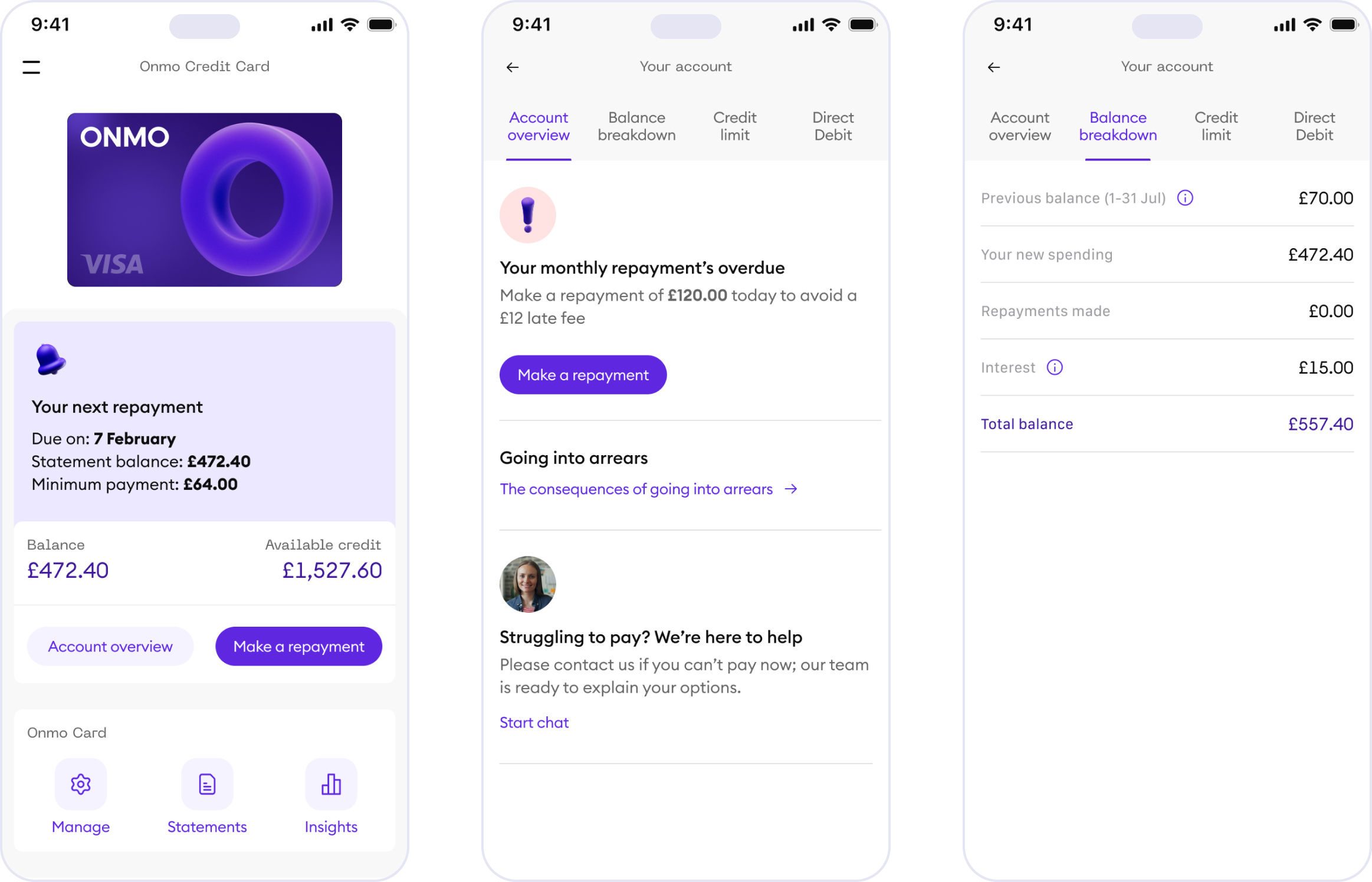
To reduce load times and improve clarity, I reorganised content so secondary information lived behind expandable cards and dedicated pages. This simplified the homepage, reduced data dependencies, and improved perceived performance.
I also introduced contextual notifications and card states to highlight critical actions — such as upcoming repayments or missed deadlines — helping users stay informed and reducing avoidable business losses.
Designing for scale and future products
While redesigning the core experience, the business was actively exploring new offerings, including a Business Card and future lending products — both without fully defined requirements.
Rather than wait, I designed a flexible navigation model that could accommodate new product lines without disrupting the existing experience. This included:
- Product-level switching patterns familiar to fintech users
- A tab-based structure to support distinct layouts and journeys
Alongside improving usability and content structure, I introduced motion design patterns and 3D iconography to bring a sense of delight to the experience — making the new branding feel alive within the app and reinforcing trust through visual and behavioural consistency across all Onmo products.
Delivery and collaboration
I led the end-to-end app redesign, partnering closely with engineering to deliver the new experience within our existing React Native architecture. Design decisions were made with platform constraints in mind, enabling efficient implementation without compromising quality.
Validation
Once the new experience was in place, I validated it through user testing — feeding directly into the creation of ONMO's in-house research and testing capability, covered in the next section.