WEBSITE REDESIGN
Overview
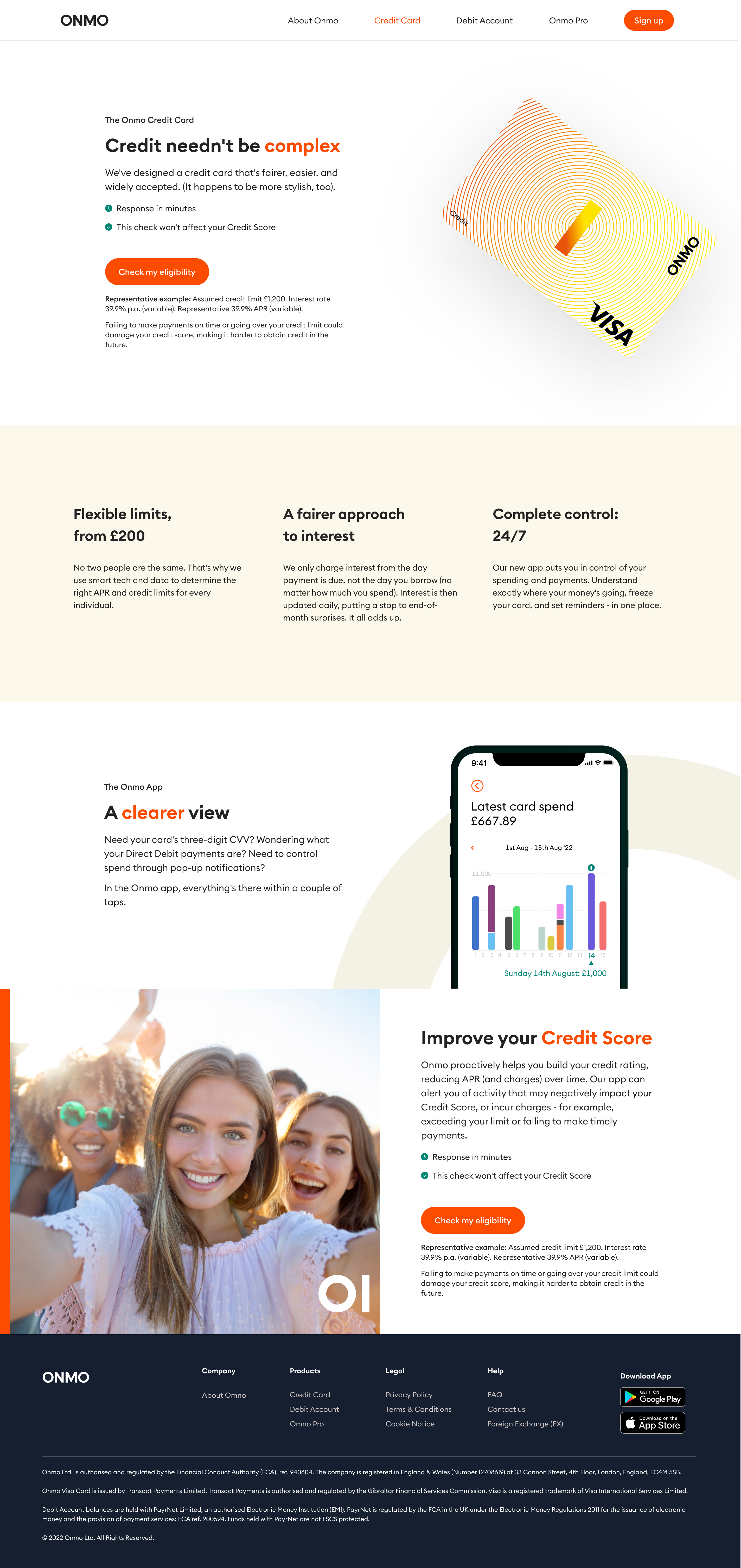
With the app and research foundations in place, the website became the next priority — ensuring the external experience matched the clarity, trust, and direction we were building in-product.
The existing site struggled in two key areas: content clarity and design expression. Addressing both was critical for a regulated credit product where understanding and trust directly influence conversion.
Content clarity and transparency
On the content side, the site relied heavily on broad slogans rather than clearly explaining the product, how it worked, or what customers should expect.

Using insights from ONMO Lab, we prioritised clarity and accessibility — particularly for users with limited financial literacy. Product pages were rewritten in close collaboration with Commercial and Compliance to ensure language was accurate, transparent, and genuinely helpful.
Key improvements included:
- Clear, self-contained explanations of product features
- Educational content addressing common questions and misconceptions
- A "What to expect" section outlining the onboarding journey step by step
Once the structure and substance were in place, a freelance copywriter refined tone and flow to ensure consistency with the new brand voice across the website and app.
Designing for a changing product landscape
At the time, ONMO had two live products and a third in development. The new website needed to communicate a growing product ecosystem while remaining cohesive and easy to understand.
The design introduced a scroll-driven experience that highlighted each product's value progressively, using motion and interaction to bring the brand to life and guide attention without overwhelming users.
To move away from the old site's static feel, we incorporated 3D iconography, micro-interactions, and the new brand symbol — transforming the site into a dynamic expression of ONMO's identity rather than a purely informational page.
Adapting to change
As priorities shifted, the business made the decision to focus solely on the Credit Card, pausing other product lines.
Although the new site was close to completion, this pivot became an opportunity rather than a setback. We refocused the narrative around a single product, simplifying structure and strengthening clarity.
Content was rewritten to clearly explain key concepts such as APR, interest, and repayments, ensuring customers understood the product before signing up — directly supporting FCA Consumer Duty requirements and reinforcing trust through transparency.
Outcome
The redesigned website became a clear and confident extension of the ONMO brand — simplified, accessible, and easy to navigate.
Externally, it communicated the Credit Card product with clarity and confidence. Internally, it became a shared reference point for content, design, and compliance teams, demonstrating how clear communication and adaptability can turn changing priorities into a stronger outcome.
